Numerous studies have shown that, in general, users do not read on the web. Whether on an application, a web page or even in a game, the results are similar. Most people just scan their screen, letting their attention get caught here and there.
Here are some things to consider to make your site or app more attractive and optimize its readability.
Text
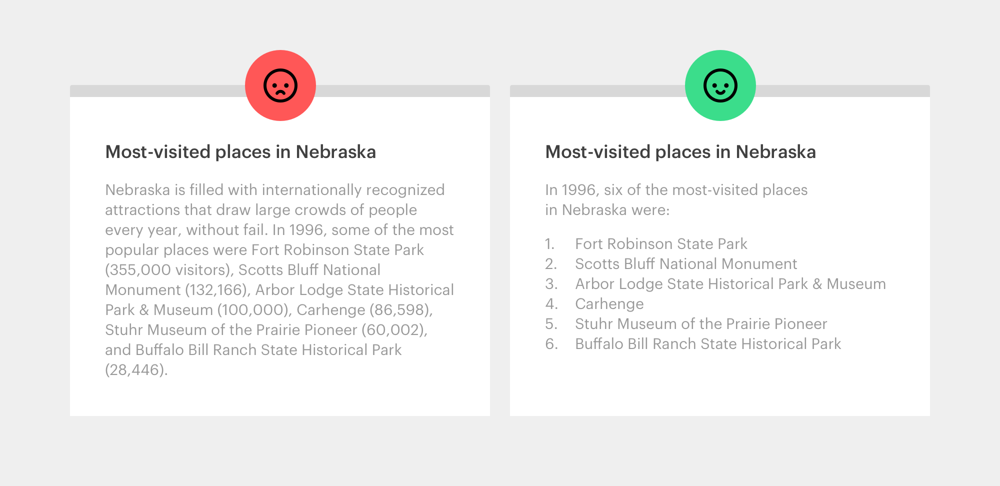
Be concise. This is the first tip to apply in order to be read. Shorten your texts to keep only the essentials.
Organize and prioritize your information. Short titles are very effective. Remember to use lists when the content is suitable. They are much less overwhelming than a big paragraph.
Typography and colors
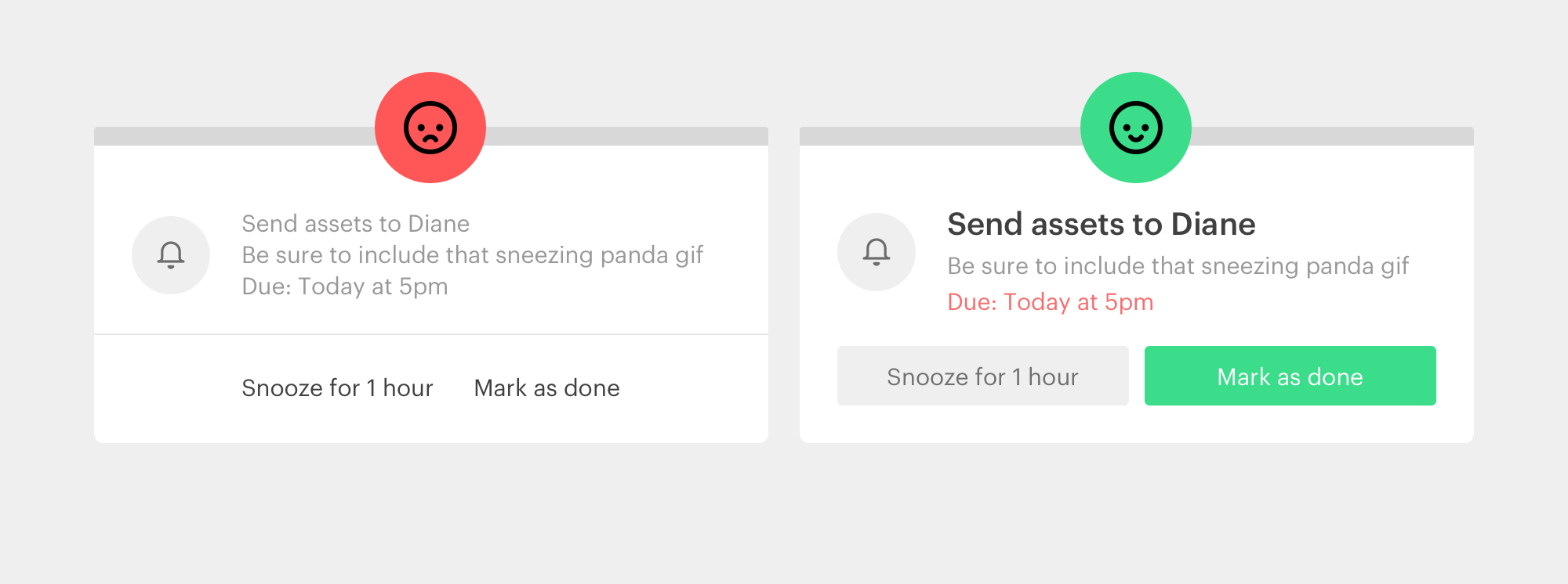
Prioritize your items. Use different font weights, sizes or colors. Guide the user’s eye to maximize the speed of analysis and understanding of an element.
A paragraph of text must also breathe. Remember to use a suitable line height and a paragraph width that is adapted to the font size. You can use this tool to calculate optimal sizes for your text: https://grtcalculator.com/
Negative space
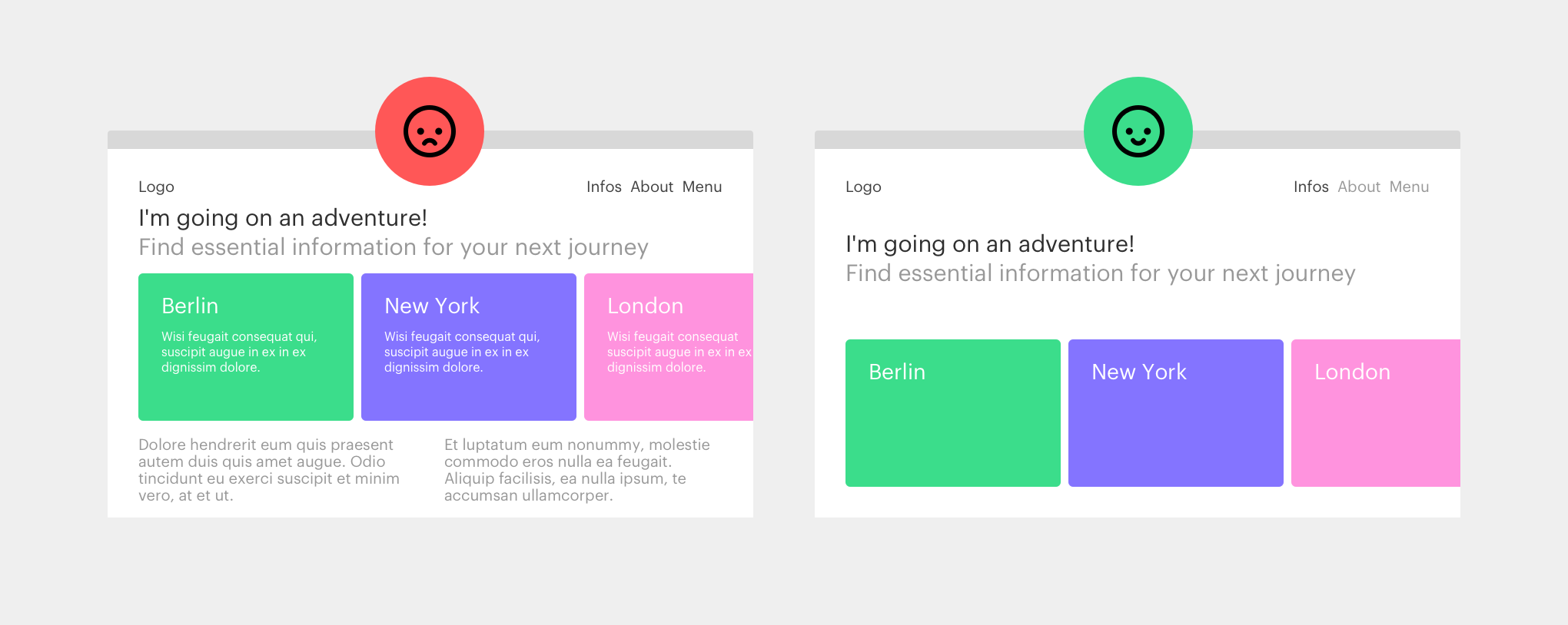
Don’t be afraid of negative space, it’s your best ally! It will make content stand out and bring harmony to the overall design. The more empty space around an element, the easier the user will distinguish it from the rest.
Affordance
Affordance is the ability of an element to suggest its own use. For example, blue and underlined text is usually recognized as a link. It is important to consider this aspect so that users feel like they are in a familiar place.
Contrast
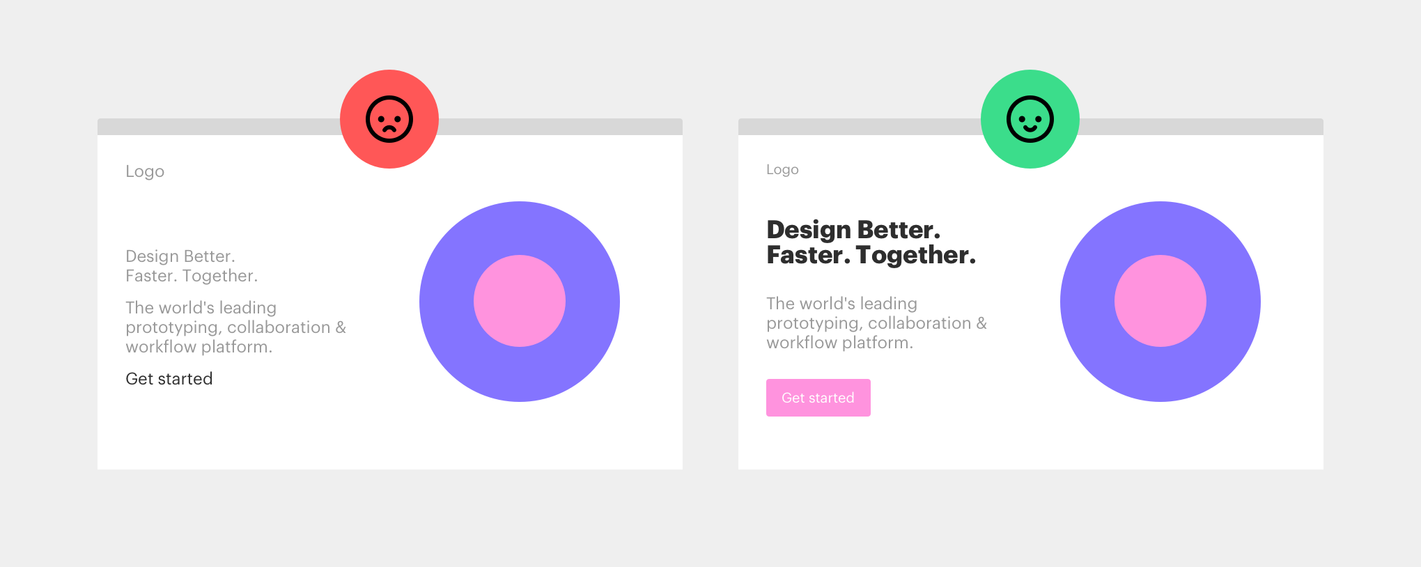
The contrast makes it possible to distinguish the different elements of a site. Title, paragraph, button … the user must be able to understand them at a glance thanks to size, color, font weight, etc.
Rhythm
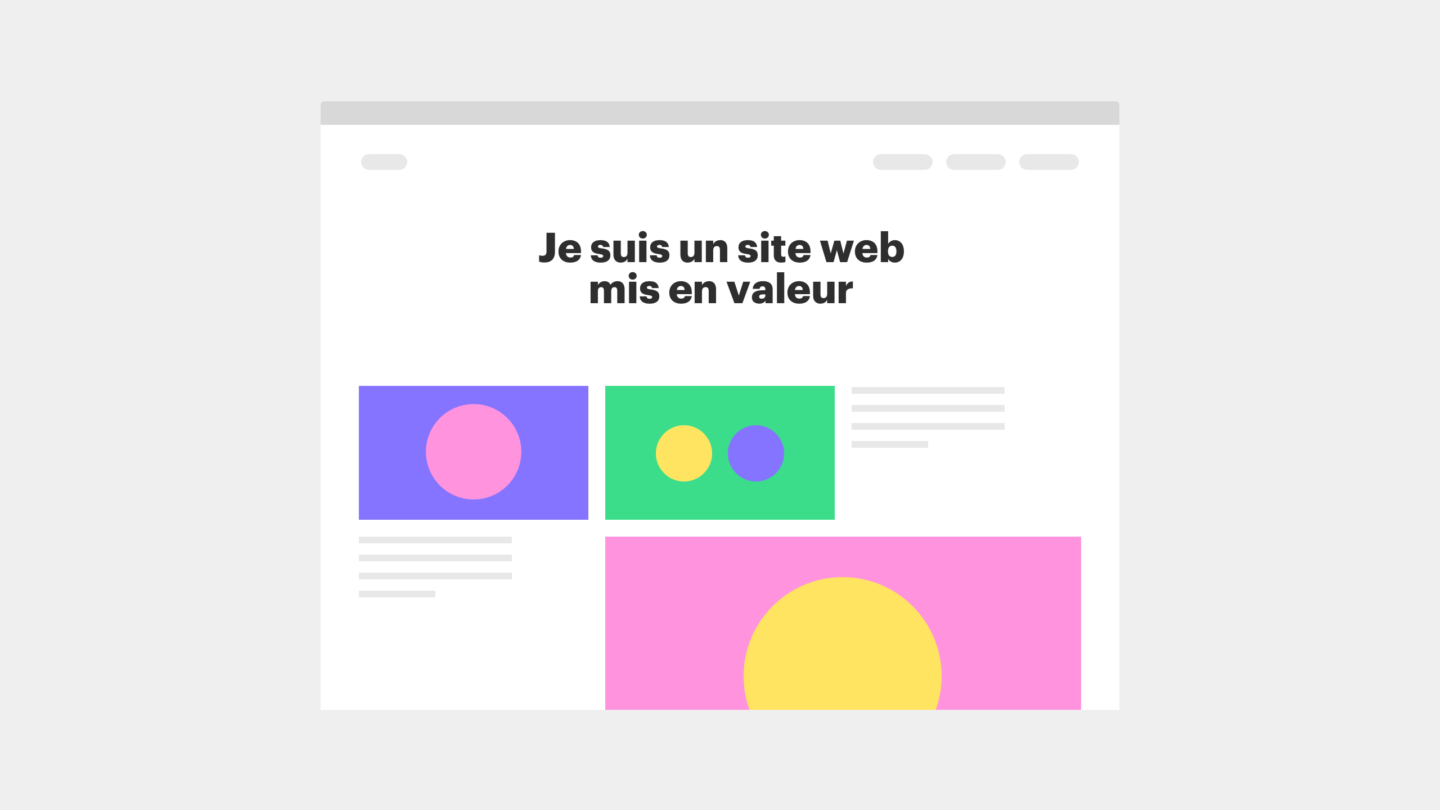
Our consumption of digital information is frenetic. We will close a page after a few seconds if we are not immediately hooked. Getting our attention is one thing, keeping it is another. Varying content is a great way to create rhythm and keep the visitor focused and interested.
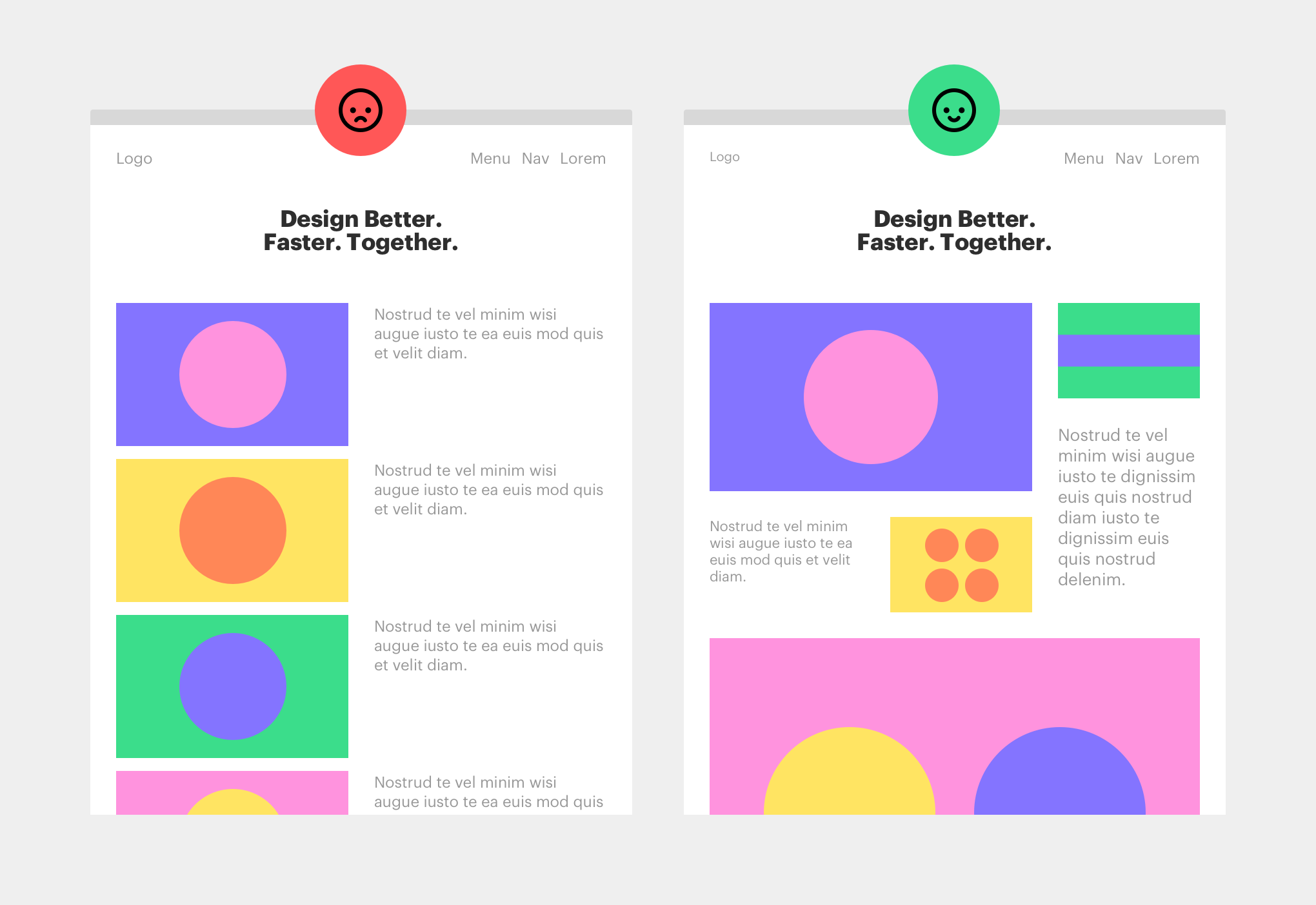
The website of the Museum of Science and Industry (Chicago) is a very good example of this. The colors and tones vary and echo throughout the page, like a poem with crossed rhymes. The size of the images and texts and their layout make the users’ eyes wander around in a pleasing and aesthetic way.
Break the rules
Of course, rules are also made to be broken and circumvented. Everything is not always to be taken literally. One should know when to rely on these conventions, and when to bend them.

