We’re in 2019. The core business of 7 of the 10 largest companies in the world is information technology. More than half of all humans are connected to the Internet. HTML and CSS technologies have more than 20 years of maturity, and today’s standard browsers support the technology needed to deliver compelling virtual reality, visual and audio experiences.
Despite all of this, it’s still not that easy to effectively align a grid nested in another one in CSS. What happened? Let’s embark on a little time travel through the different methods of laying out elements in web pages!
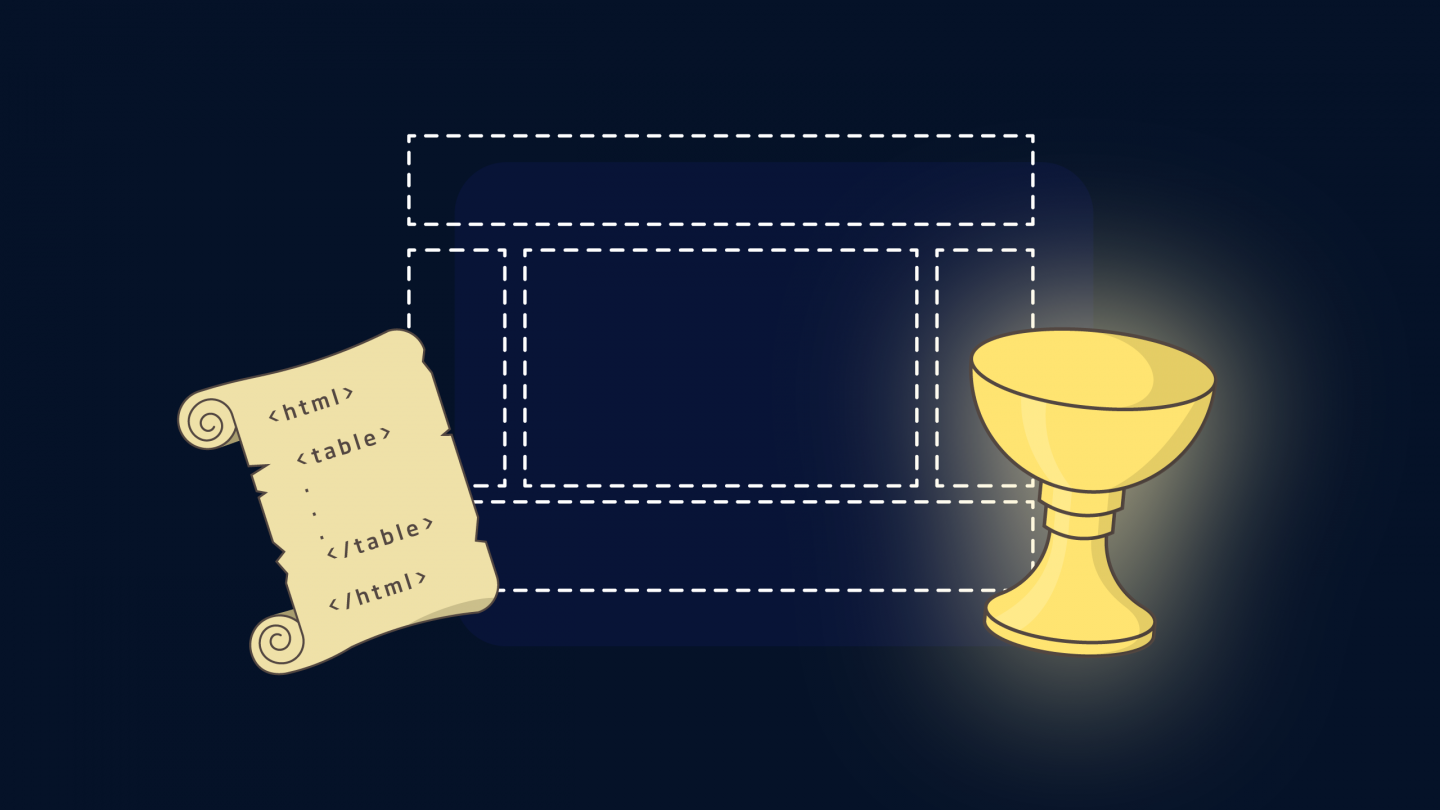
The web layout “Holy Grail”
The “Holy Grail” – a symbol of the Arthurian legend and name of a famous Monty Python comedy – is also the name that was given to a specific layout of elements on a page in the early days of web development.
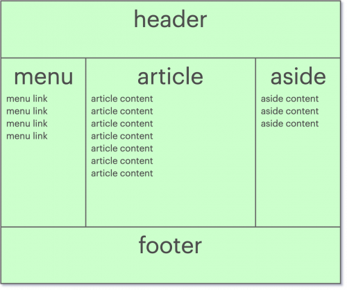
This layout, which encompassed the main use case of many web platforms, is composed of three different parts, named :
- header, at the top of the page, spanning the full width of the page.
- footer, at the bottom of the page, spanning the full width of the page.
- menu, content and aside, dividing the center of the page into 3 columns. Each one of them uses the rest of the page height.
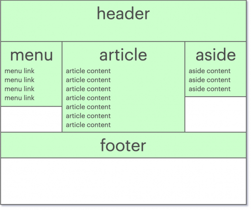
Challenge
The challenge to solve was to make each of the 3 central columns occupy the entire height. At a time when HTML and CSS were in their infancy, the most elegant answer to this challenge was not obvious. To the point that the search for the solution was compared to the search for the Holy Grail, hence the name of the layout. It was easy to arrive, for example, at the following result where the columns do not reach the bottom of the page :
The difficulty was to find a way to write the page so that it both rendered correctly in all the browsers of the time (which, it should be remembered, had many more differences between them), and had the code semantically correct and optimized for indexing by search engines.
Although solutions existed already, there were not intuitive. Wikipedia has an article on the subject and shows some of the most popular solutions to this problem. The most common solution was certainly to use a <table> to place items on the page.
History: Positioning with table, and “tableless”
Organize the page with a table
Version 2.0 of the HTML specification, released in late 1995, described the use of the <table> tag to organize tabular data in the form of a table.
The main use of the tag was very quickly diverted, as developers realized that it could be used to easily place all the elements of their web page on the screen; one cell per “part” previously described.
This positioning method had become very popular because it was simple to implement, but had a major disadvantage: it was semantically incorrect. Meaning that you can use an HTML element to insert data that this element is not supposed to contain.
The cost of this disadvantage is not only reduced accessibility, but more importantly the inability of search engines to correctly understand the content on the page, and therefore to recommend it during a search.
Despite this, the simplicity of understanding and implementing this solution has propelled its popularity (and I think to some extent contributed to the popularity of HTML itself, resulting from the ease of organizing information in a page; whether from a classic text editor or a WYSIWYG HTML, which has also started to appear).
Organize the view with CSS
The use of tables was so prevalent, that the very fact of not using a table on a web page has a name and a Wikipedia page: the “tableless” web design.
Layouts using a table had become commonplace, but the arrival of new technologies in browsers began to change habits. The browsers support of newer standards such as CSS2, as well as the redesign of some of the major sites at the time, popularized the separation between the content and the display of a web platform: an HTML file containing the text of the page (content), and one or more CSS files containing the directives to display it correctly (display).
The advantages of replacing table tags by semantically appropriate elements according to the situation were numerous:
- Search Engine Optimization (SEO): Search engine robots could more easily understand what the important content of a page was, and how it was organized.
- Features: The
tableelement has very few features that control content placement. - Accessibility: The desktop screen was already not the only way to browse a web page. Screen readers (e.g. for the visually impaired or dyslexic) and mobile phones – whose popularity was growing – also appreciated understanding how information was structured on a page in order to function properly.
- Bandwidth: The size of an HTML file, as well as the average network transfer rate at that time, were several orders of magnitude smaller than those of today. A table in HTML requires a remarkably high amount of characters (compared to other structures). The shift from tables has reduced the average page size, and therefore reduced the time it takes to download pages.
Some techniques
The techniques to produce a “Holy Grail” layout in CSS are numerous, even in CSS2. Let’s recall the main problem: the goal is to split the center of the page into 3 columns, and each of them should fill the whole available height, no matter the size of their content. The goal is not to list all the methods here, but we will name one or two of the most popular ones.
display: table
The first solution that emerged with the new CSS standards is very naturally to try to reproduce the previous behavior. It is obvious that the display: table property was going to become popular. It displays an element as if it were a table. All you had to do was to replicate the same structure as the table you were using before, and replace its elements (table, tr, td, …etc) with their equivalent CSS display properties (table, table-row, table-column, …etc). This solution, although functional in the sense that it avoids using table elements (and can, therefore, be semantically correct), is not optimal. It keeps some of the disadvantages of using a table, notably the amount of code needed to display it.
float
The CSS float property makes it easy to position an element left or right in its container. Although simple in appearance, this property does not directly address the problem and hides some complexities. At the time, one blog article attracted a considerable amount of attention by showing a practical example of their implementation. The proposed solution is functional, but requires substantial and not very intuitive code.
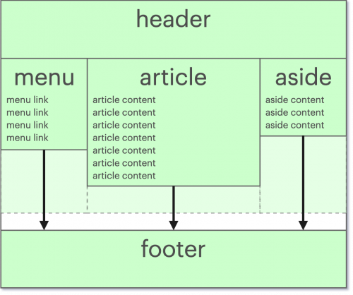
Bottom padding
It is possible to expand the space occupied by an element by specifying one or more CSS padding properties. This creates a space on one side of the element that is only intended to remain “empty”. This gap is inserted between the content of the element and its border. So the idea was to add this space towards the bottom of the columns so that it colors the free space. However, it was impossible to know the exact amount of space to be added for each column.
That is where the margin property intervenes, which defines the size of the margin between the current element and the other elements of the page. Thus, it is easy to add extra empty space… or, in this case, to remove it. In fact, it is possible to assign a negative value to this property. We would therefore use a negative margin of a value corresponding to the padding so that the element colors the page all the way down without taking up more space. So, the code for columns of class column in a wrapper of class wrapper was as follows :
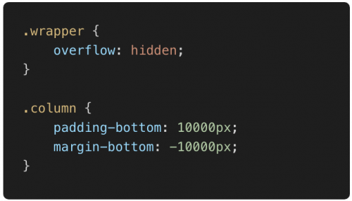
Once again, it was possible to achieve the desired visual result, but at the cost of a relatively messy solution.
JavaScript
Given that JavaScript can run at any time and has access to all elements of the page, it is also possible to calculate and adjust their size “mathematically”. However, this solution unfortunately comes with additional latency and reduced performance. It is therefore a priori never optimal to address a layout problem on a page. Although highly discouraged, it seemed incomplete to me not to mention this horrible method.
We reviewed the main problem and different historical solutions. We will talk about the methods used nowadays to deal with these problems in the next article!