Digital technology takes central stage in healthcare
Health platforms and apps have multiplied at a great pace. Patient monitoring, care coordination, professional tools for healthcare providers, home care solutions. Software is no longer a simple administrative support. It now plays a direct role in care pathways, professional practices and the patient experience. In this context, the quality of the user experience is no longer a comfort, but a condition for reliability, adoption and quality of care.
With SurgeID, the app becomes a practical companion, not just an administrative tool
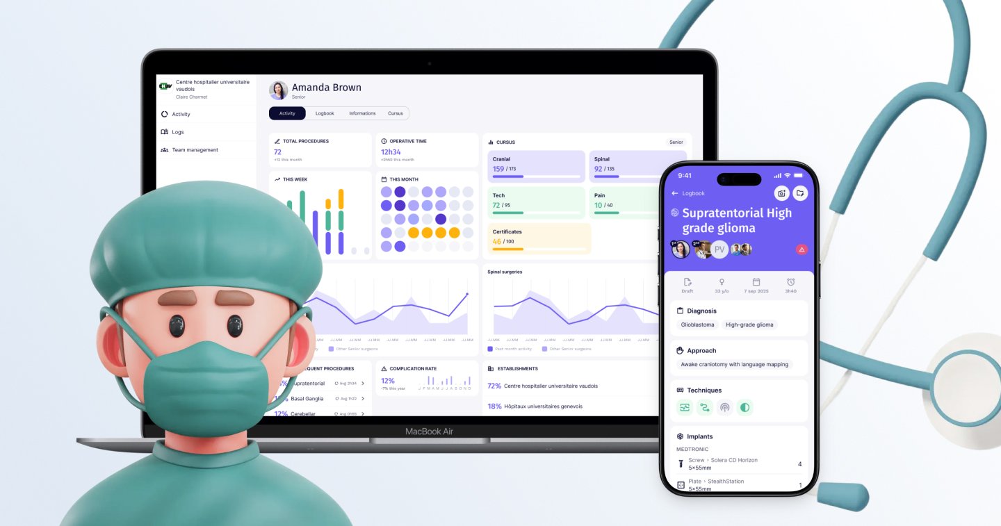 We designed the solution to support surgeons throughout their journey: from initial training to FMH practice, including the tracking of each procedure and academic credits. A tool to document, progress and improve, both in individual practice and in team-based work.
Interfaces that cannot afford to fail
Unlike consumer products, these systems are not designed to capture attention. They must integrate into existing practices, sometimes cumbersome, sometimes critical. Poorly designed experiences do not just waste time. They complicate work, create friction, and can discourage use, ultimately affecting care.
This is why UX in healthcare is a subject in its own right. Users are diverse, contexts are constrained, and regulations are numerous. Design must reconcile professional practice, medical regulations, and technology, sometimes even reluctant users, without ever losing sight of the essentials: ensuring the tool is understood, usable, adopted, and used over the long term.
Interface for the ICC medical and toxicology analysis laboratory
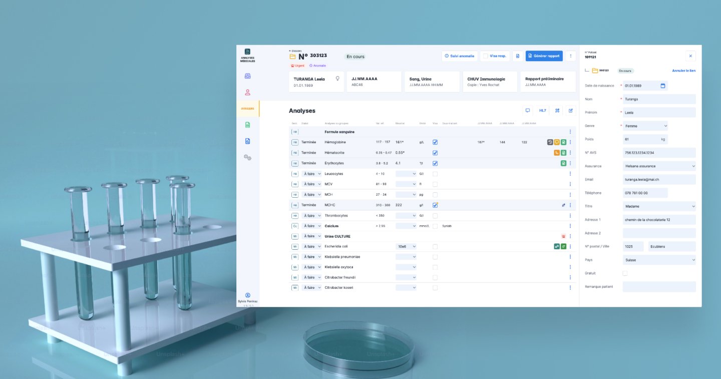
Each result displayed had to contribute to a diagnosis, guide a treatment, or serve as the basis for a judicial or forensic report. Under these conditions, we worked without allowing any room for approximation.
Create routines, not friction
In healthcare, digital applications take many different forms. Among other things, they can be work tools used several times a day by healthcare providers, decision and support tools for doctors and scientists, or support and monitoring tools for patients. In all cases, their value is measured by their ability to integrate into everyday care practices.
Good UX, therefore, is not limited to usability. It must support repeated actions. Entering data after a consultation, recording PROMs to monitor the patient’s perceived progress, checking a series of indicators before a medical decision, following a protocol or treatment over time. Adoption is built through repetition and consistency: simple workflows, a stable logic from one screen to another, and clear feedback confirming that an action has been acknowledged. At Apptitude, we design interfaces that help establish these routines, so that applications support daily care without ever complicating it.
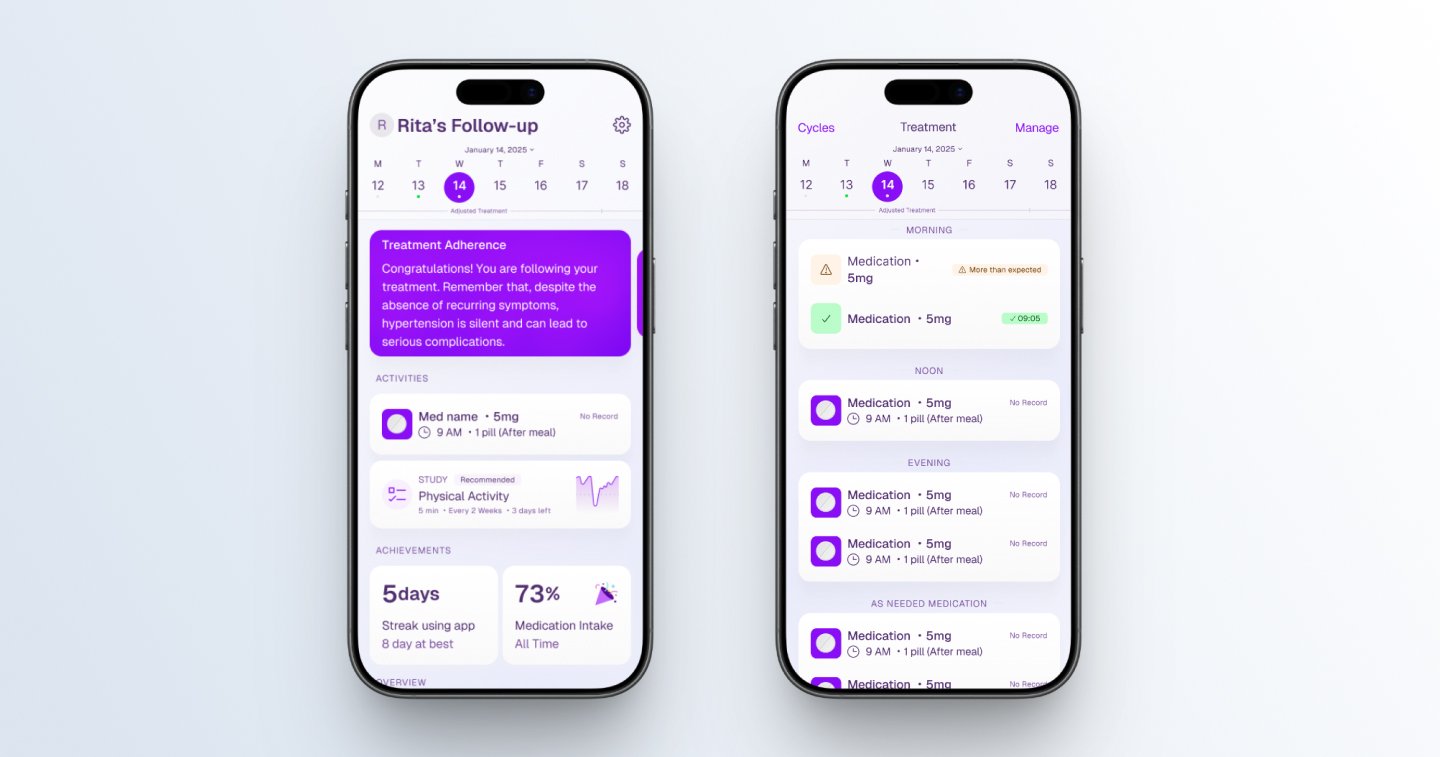
HeartCare mobile application for hypertension monitoring
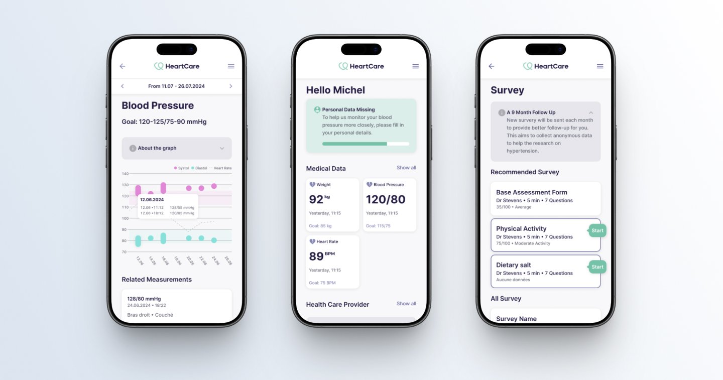
Regular data entry by the patient allows for more precise treatment adjustments by the medical team. UX work played a key role in encouraging consistent data entry, through subtle patterns such as progress visualisations and supportive feedback.
Design clear screens, even with complex or data-heavy content
In healthcare, care relies on a large amount of data. Medical records, histories, alerts, statuses, results. Accurately capturing this data and then enabling it to be read and interpreted is part of daily practice. PROMs, for example, provide valuable insight into the patient’s experience. But their collection must be designed to be understandable, non-intrusive, and sustainable over time. The risk is attempting to show everything at once, which can discourage both data entry and understanding.
Too much data displayed ends up obscuring what is truly useful for decision-making. Clarity, therefore, does not start with the screen alone. This begins upstream, with a deep understanding of the information to be displayed: how it is used, by whom, and at which stage of the care pathway. At Apptitude, we work closely with professionals to identify what is genuinely useful, avoiding the display of information without immediate value.
Layout reinforces this logic through hierarchy and grouping, offering layered reading: essentials first, details on demand. This leads to calmer screens, faster decisions, and better-quality data over time.
domo.health platform for home healthcare providers and informal caregivers
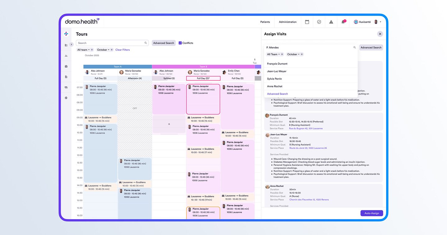
The calendar view streamlines route planning by integrating care requirements, staff availability, and transit times. In such an information-heavy interface, clarity is essential to ensuring operational efficiency.
When the context leaves no room for error
Healthcare tools are designed for the real world, not for perfect environments. They are used by people of all ages, often tired or stressed, who may be navigating temporary or permanent disabilities. These tools must perform under challenging conditions: on the go, in low light, on low-resolution screens, or while wearing gloves and protective eyewear. In these settings, a poorly legible interface doesn’t just hinder workflow, it becomes a critical failure.
At Apptitude, we integrate these constraints from the very first prototypes. We prioritize high contrast, legible default font sizes, clear interactive states, and generous touch targets. Our interfaces are designed to be intuitive without relying solely on color. Ultimately, these accessibility standards benefit everyone: a truly accessible interface is more robust, more reliable, and more comfortable for every user.
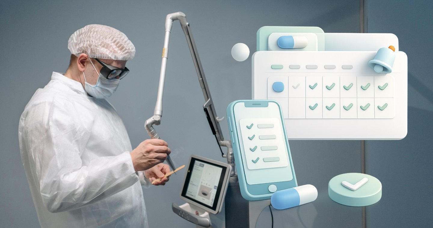
Support and alert management UI for the Dexter surgical robot
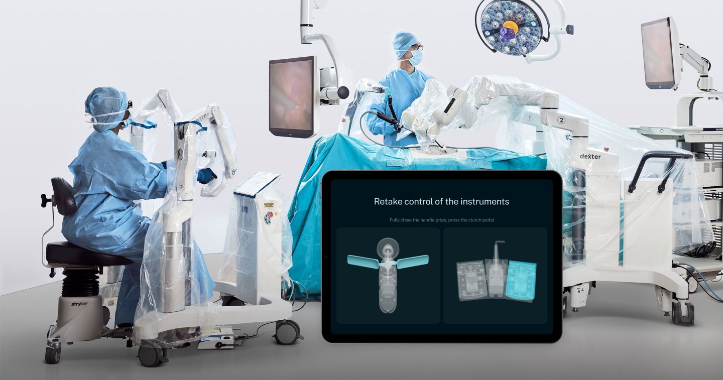
Highly-constrained environment: the surgeon stands in front of a suspended display screen, in a sterile field, wearing 3D glasses and two pairs of latex gloves, with the UI protected by a plastic film. Design choices are therefore crucial.
The UX had to remain legible, reliable, and immediately understandable, as every detail can make a difference when a system alert occurs.
Testing for real-world reliability, not for a checkbox.
For certified medical devices, user testing is not optional. Standards such as IEC 62366, dedicated to usability engineering and human factors, require demonstrating that the interface can be used safely and effectively by the intended users, in their real-world conditions of use.
Beyond mere regulatory compliance, these tests are a vital design tool. Observing real-world use and identifying hesitations or misunderstandings reveals risks that remain invisible on a static mockup. At Apptitude, we view user testing as a driver for safety and quality, not just a final validation step. It informs our design choices, guides our priorities, and allows us to iterate on the interface before issues arise in the field. In a high-stakes environment where margins for error are slim, testing is, above all, about safeguarding the user experience
Anticipating bed shortages at CHVR
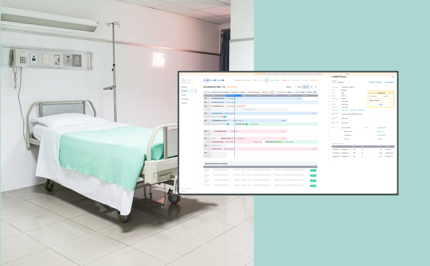
Designed to anticipate bed shortages, the platform allows teams in Valais hospitals to visualise real-time bed occupancy within departments in order to allocate them as efficiently as possible. User testing conducted with hospital staff helped adjust workflows, display priorities, and interactions, ensuring informed decisions in a multi-site context (5 hospitals, over 850 beds, 40,000 patients admitted per year).
Care is also in the details
It is often the micro-details that determine the perceived quality of a tool. Understandable and actionable error messages, immediate feedback after an action—whether a load, a validation, or a failure. Clear labels, accurate professional terminology, validated with field users. These elements prevent doubt, hesitation, and workarounds.
Taken individually, these details may seem minor. Together, they make a real difference. Less frustration, more trust in the solution. A relationship forged over time, moving at the pace of care and real-world use.
UI for the LaserClast35 lithotripsy medical device by EMS
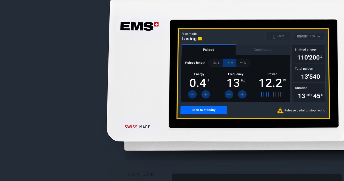
In designing this interface, every detail mattered: precise microcopy, clearly differentiated states (ready, in progress, error), and immediate feedback for every action. Special attention was also given to the icons, to make the different power modes readable without cognitive overload.
The UX also had to accommodate mixed interactions, combining the screen interface with the device’s physical elements, such as the hand controller and foot pedals. The design had to ensure seamless consistency between physical actions, system status, and on-screen visual feedback, eliminating any ambiguity during clinical operations.
How far design can help
However, in healthcare as in other contexts, adoption is not always a choice. Some tools are imposed, others adopted out of regulatory or organizational obligation. In these situations, UX quality does not guarantee engagement, but it becomes all the more essential to minimise unnecessary effort, errors, and user fatigue.
Design can facilitate use, but it cannot, on its own, overcome resistance, the loss of familiar landmarks, or the fear of losing control.
Mobile application for patient monitoring during cancer treatment
The interface is not intended to treat or make recommendations, but to provide daily support. Our work as designers was to help track and understand, without judging or assessing the effectiveness of a treatment. Encouraging consistency and clarity, reducing unnecessary friction, to make room for what truly matters.
How healthcare changes the way we design
In healthcare, good design is invisible. It’s the kind that allows others to do their work without getting in the way. Healthcare is a field where design has a real, tangible, and human impact. The tools we create are not merely incidental; they shape actions, influence decisions, and define relationships. And sometimes, they are there to support the most sensitive moments of life.
Designing for healthcare means taking on a unique responsibility—the responsibility not to complicate, not to distract, and not to add burden where there is already enough. This begins with a true understanding of the stakes, the workflows, and the contexts of use. Design must know its place: it exists to serve the user.
At Apptitude, what drives us in these projects is creating discreet and robust tools. Interfaces that step aside, when needed, to make room for what matters most: care, professionals, patients, and the relationships built around them.
You can learn more about this approach through the projects featured in our healthcare and wellbeing portfolio.