N. B. : This article is a follow-up of the first article about web layouts, which traced a history of the problems and their solutions. This article is not a technical tutorial on Flexbox and Grid, rather a review of their principles and use cases.
Flexbox and Grid
The “CSS3” specification, successor to CSS 2, is a specification divided into several modules. Each of these modules can be implemented and supported differently by browsers. Two of them have radically changed the usual way of laying out elements on a web page:
- The “Flexible Box” (or Flexbox) module, which most browsers started to support between 2013 and 2014.
- The “Grid” module, which most browsers started to support in 2017.
Changing needs
It is not surprising that the needs of web development change when you look at the evolution of the market share of browsers between 2009 and 2019.
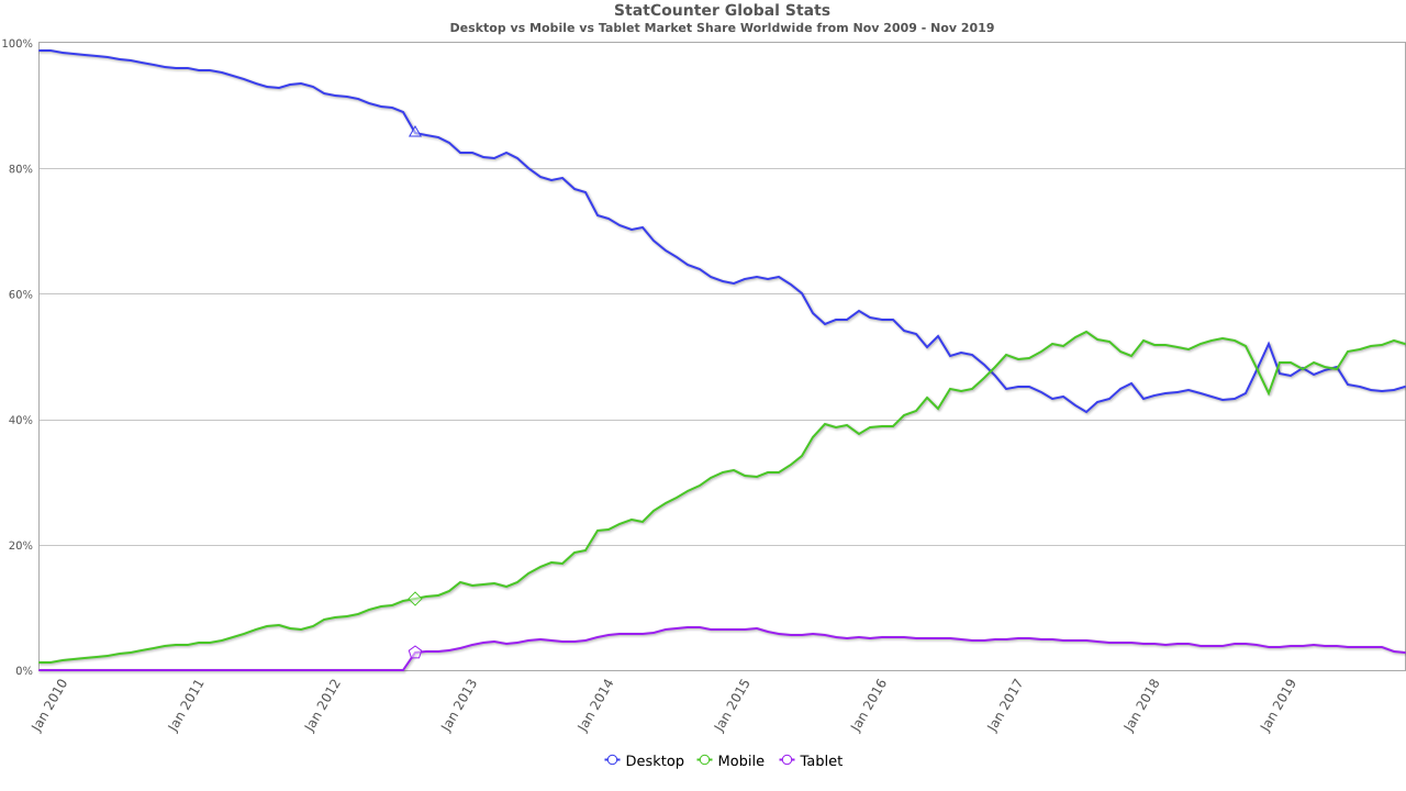
The emergence of smartphones had drastic consequences on the considered optimal layout of web pages. Suddenly, there was only a much thinner screen to display the same content. Although the resolution of smartphones has continued to increase, the physical size of their screens did not follow the same trend immediately. As a result, it was no longer possible to display as much content horizontally on a smartphone as it was on a desktop.
The Flexbox specification allows this problem to be solved much more easily than before.
Benefits of Flexbox
The Flexbox specification provides a range of features and tools that can be combined. The Mozilla documentation explains :
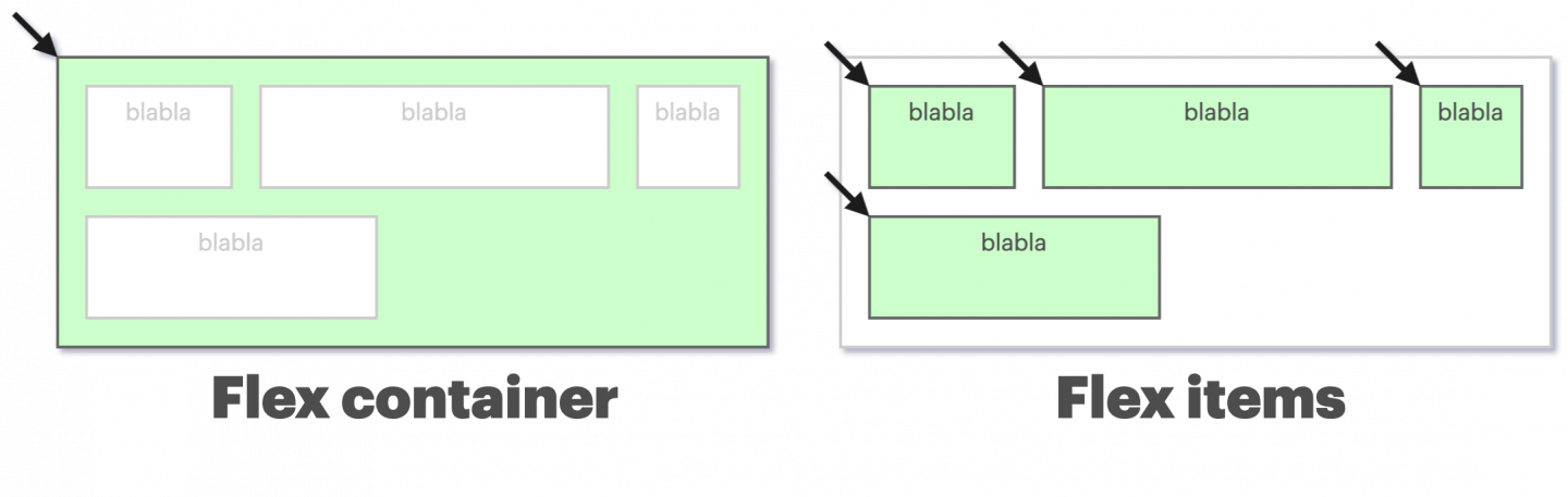
Flexbox is a one-dimensional layout method for laying out items in rows or columns. Items flex to fill additional space and shrink to fit into smaller spaces.
The Flexbox layout consists of a container and one or more items. Unlike the table, the items are placed in a single axis in the code (no distinction between row and column). The elements are positioned and adapted to the container automatically. For example, it suffices to specify the flex‑wrap: wrap to container property so that the items are arranged in several rows if necessary. That makes it easier to design a web page for a mobile display with a limited width.
We can specify default properties that will apply to all elements. Then, each of them can then redefine its own behavior. Among the features, we find properties to easily manage :
- Alignment on each axis
Spacing between elements
Items “wrapping” (shifting an item to the next line if necessary)
Elements extending to fill the available space
The mix of all these features allows for enormous flexibility in the layout of the elements. It is now possible to solve once tedious problems with two or three intuitive CSS instructions. The “Holy Grail” layout discussed in the previous section is trivial to reproduce now.
In summary, the Flexbox module has made it significantly easier to design web pages for mobile display. It is still an extremely versatile tool, and one of the preferred methods for structuring content on a page today.
Limitations
Despite all the aforementioned upsides of Flexbox, there still remain some behaviors that are difficult to reproduce using Flexbox instructions. For example, it is common to want to align elements vertically on a page, according to given columns. Many CSS frameworks (such as Bootstrap) offer a grid system, where the horizontal space of a page is divided into columns (often 12 of them).
Let’s try to reproduce this behavior in a simple manner with Flexbox. A problem occurs if you try to divide a page into several columns of unknown equal width, separated by margins. An intuitive approach to letting certain elements occupy several columns would be to vary their flex‑grow attribute. However, one quickly notices that rows containing different column configurations are not aligned.
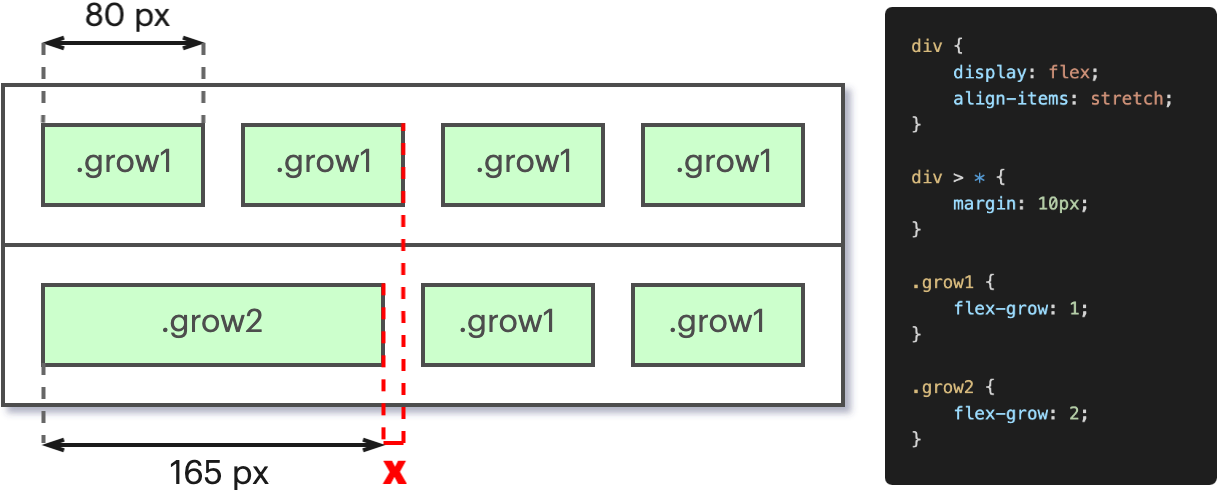
The explanation is quite simple: Since the space between two columns remains constant, “merging” two columns effectively removes a margin width from the row. Indeed, one can count on the illustration that the first row has a total of 5 white spaces between columns. The browser therefore distributes this extra space to enlarge the elements, resulting in their misalignment.
This part of the problem can be solved by applying more complex logic with the addition of several attributes. However, the lesson learned is that despite the usefulness of Flexbox, the module is not the cure-all of the web either.
Grid’s arrival
Although the idea of aligning elements to columns is implemented on some pages as early as 2011 (using CSS frameworks as mentioned above), the standard allowing to reproduce a native equivalent is only supported around 2017 (with, however, many additional features).
The Grid module allows to answer the request to organize the page content according to columns, and within “boxes”. We return at this point to a paradigm that comes close to the initial use of the table tag. Each element is placed again in two distinct axes; horizontal and vertical. However, this time the Grid specification is obviously adapted to the use case for a complete page; it is no longer a component diverted from its original use as was the table.

Packing more features, the Grid allows you to easily align independent elements on a page. A Grid consists of a defined number of rows and columns. The concept is to allocate an area (Grid Area) to an element, and it will be confined to it. Any rectangle formed by one or more cells of the Grid can constitute an area. Like the individual components of Flexbox, each row and column of the Grid can define its own size and behavior. It also provides space (called Gap) between cells.
CSS properties
The Grid module describes a dozen new CSS properties, of varying degrees of complexity, to allow customizing all the previously defined new behaviors (and more). Each one has its own utility and can define one or more aspects of the Grid behavior. But in my opinion, there is one that is particularly interesting, because it is very explicit and intuitive: The grid-template property. Instead of describing it, here is an example of its use:
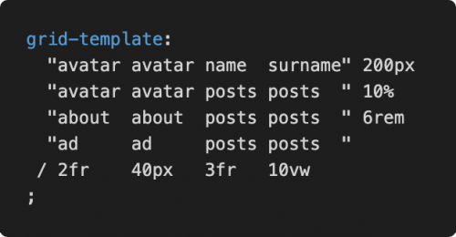
The CSS code matches the visual result we will have on the page! It is possible via this property alone to define the shape of the grid, as well as to immediately specify the size of each track, and the content it will contain. What a gain in clarity! There are still some behaviors that are not possible to define here and one or two additional lines may be necessary, but in my opinion reading this property is enough to understand the layout of the content. Once this property is set, a content item is assigned to the location by using its name with the grid-area property. For example, grid-area: avatar; will assign the concerned element to the space occupied by avatar in the Grid.
Responsiveness
Now that we are revisiting a paradigm where we place an element on two axes (as with table), the question of displaying on smaller screens naturally comes up again. However, there are two significant differences in this case:
- The layout of the components is defined in CSS, not in HTML.
Browsers support the CSS3 Media Queries specification, which allows to apply a different set of CSS rules depending on the size of the browser.
By stating these two points, the solution becomes obvious. As we now set up the positioning in CSS, we just have to define a different layout for each different size range we want to support. So we have full freedom to completely change the layout of our grid depending on the screen.
Support and adoption
The possibilities that the Grid opens up are interesting, but its adoption is certainly not yet the most widespread. Browsers only support it completely and without bugs since mid-2017. Despite this, its popularity is still accelerating.
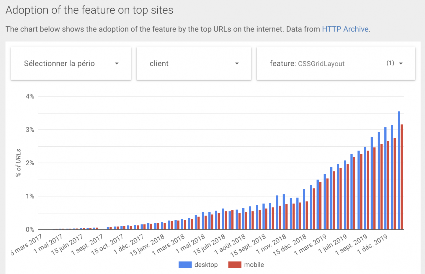
So we notice that Grid answers a need that has been present for a long time, and its use is starting to climb. What more can we want? More in the next part!