N. B. : This article is a follow-up of the second article about web layouts, which traced a history of the problems and their solutions. This article is not a technical tutorial on Subgrid, rather a review of its principles and use cases.
Subgrid
The next anticipated evolution of standard web layouts is certainly the support of the subgrid specification, called… Subgrid. In short, it is the possibility to place one Grid into another, and make them “interact”. The basic Grid is still not widely used, but this new specification adds a lot of tools to it and makes it more powerful. As I write this, support for the CSS Subgrid module has just been announced in the latest version of Firefox, version 71. This is the first browser that fully supports the module. The future may be closer than I imagined!
Specification
The Subgrid module provides useful features when nesting a Grid into another Grid. We will call the first Grid “main”, and the grid inside it “nested” (or “Subgrid”). The primary purpose of the specification is to allow the tracks of the Subgrid to align with the tracks of the main Grid.
Use cases
It is true that at first glance, embedding a Grid into another may seem convoluted. Why would anyone want to do this? What is there that we can’t already do by assembling Grids and Flexboxes? We’ll take a simple, yet very telling use case.
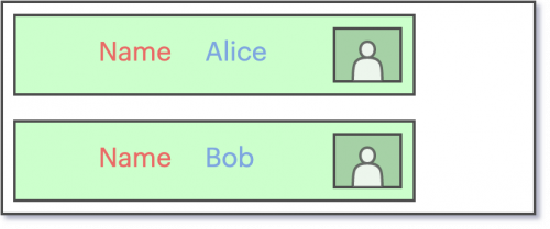
Let’s say for example that we want to display the list of a platform’s members in the form of small horizontal cards. We wish to display the first and last name of each person, with their profile picture on the right. We want to leave space between each one of these elements, but we also want them all to be aligned. That is, all first names should be vertically aligned, and all surnames should be vertically aligned. Our basic case is quite simple.
Attempt: Using Flexbox and Grid
This case looks easy to do with Flexbox, and it is. Just cut the card into different items, each containing a part of text or image. The following figure shows a simple cut-out, where we isolate name, first name and image into one item each:
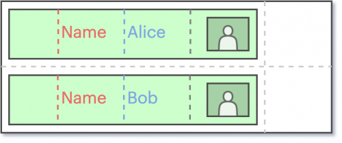
So far, the surnames and first names are smaller than the boundaries they have been given. What happens if we add a person with a bigger first name?
The card with the longer name sees its item lengthen and move others around it to make room. This is very often the behaviour that we ask of Flexboxes. However, we have now broken the vertical alignment with the previous cards. It would of course be possible to manually adjust the alignment of each of these items. However, this is not what we want here. We don’t know in advance the size of the names and surnames we will display. How can we decide how much size to allocate to each of these elements?
It is obvious that we are missing a tool here. We have completely independent cards, but want some of their elements to be aligned with each other. Using a simple Grid in each map doesn’t get us anywhere, because we couldn’t “link” the columns together…
Solution : Subgrid
This is (obviously) where the new Subgrid module comes in!
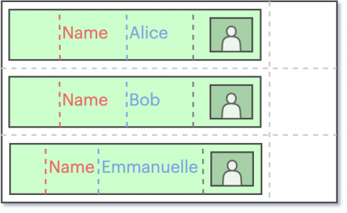
By creating a main Grid, then a grid within each card, we will be able to “attach” the column of a card to the column of the main grid. This will effectively “link” the columns (a main column with its nested column). The content size of a column will still be adaptable if we decide so, but from now on this will affect the whole main column, and thus the other cards. This will therefore have the effect of keeping the alignment of the contents, regardless of their size, between each card.
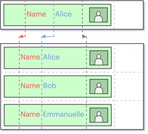
We can see that by assuming that we cannot set a fixed size for each column in advance, on top of having them fit the content and stay aligned, Subgrid is the natural solution to the problem. It is now very common to assign a pre-defined size to such items to keep them aligned, at the risk of displaying content over multiple rows. Although functional, this compromise can now be resolved.
Features
We saw in the previous section how to define the disposition of a grid. The code needed to “link” a subgrid to its parent grid is – again – quite explicit. It is also possible to link just the columns, or just the rows.
This behaviour is driven by two properties. So, to link columns to the parent grid, use grid-template-columns: subgrid, and to link rows to the parent grid, use grid-template-rows: subgrid.
Although this is not the only addition to the standard, it is certainly the main functionality. It is for instance also possible, using Subgrid, to name specific rows or columns, in order to gain clarity in declarations later on.
Compatibility
At the end of 2019, Subgrid’s browser compatibility is under way. Currently, only the latest stable version of Firefox supports the Subgrid module.

Just like the other standards, we can estimate that there will be a certain delay between the module’s implementation by the browsers, and the actual use on web pages. We have seen that the Grid module, released more than 2 years ago, is still very underused (even if it is becoming so little by little). Moreover, there is currently no complete polyfill allowing backward compatibility with older browser versions (there is one, only allowing to basic functionalities). The use of Subgrid is in its infancy, but the implementation by Firefox is already a big step towards its popularization.
Conclusion
Our time travel through web pages layouts is over… for now. We have seen that, although the patterns and behaviors we are trying to reproduce are not visually sophisticated, they hide a real complexity in the underlying code structure. Different problems have arisen at different times, and have given birth to good practices… and less good ones (let’s forget tables, shall we?). Furthermore, when we ask ourselves “Why don’t our browsers support X functionality yet?”, we should take the time to realize that there is a great deal of temporal inertia between the moment when :
- The need for feature in the browser appears
- This need is qualified
- The design of a solution is created
- The feature specification is published
- Browsers implement the specification
We undoubtedly still have some CSS hacks to see coming in order to respond to future use cases. The demand for a feature (both by users and developers) definitely influences the speed of its implementation by browsers. In the meantime as far as Subgrid is concerned, it is – as mentioned in the previous section – already possible to use its basic features carefully, with backward compatibility ensured by the polyfill mentioned.